Data visualization & plots
The outputs of Pytmosph3R can be visualized either with the module pytmosph3r.plot (HDF5 file) or with third-party softwares such as ncview or ParaView (netCDF file).
Note
For more information on all available plots, see pytmosph3r.Plot.
How to visualize the data with ParaView?
ParaView can be downloaded at https://www.paraview.org/download/. The present tutorial is based on version 5.8.1. Once installed, you can open a netCDF file with:
paraview output_pytmosph3r.nc
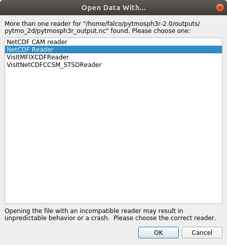
You should then have a pop-up window similar to the one below. Choose the option “NetCDF reader” or, for older versions “NetCDF files generic and CF conventions”.
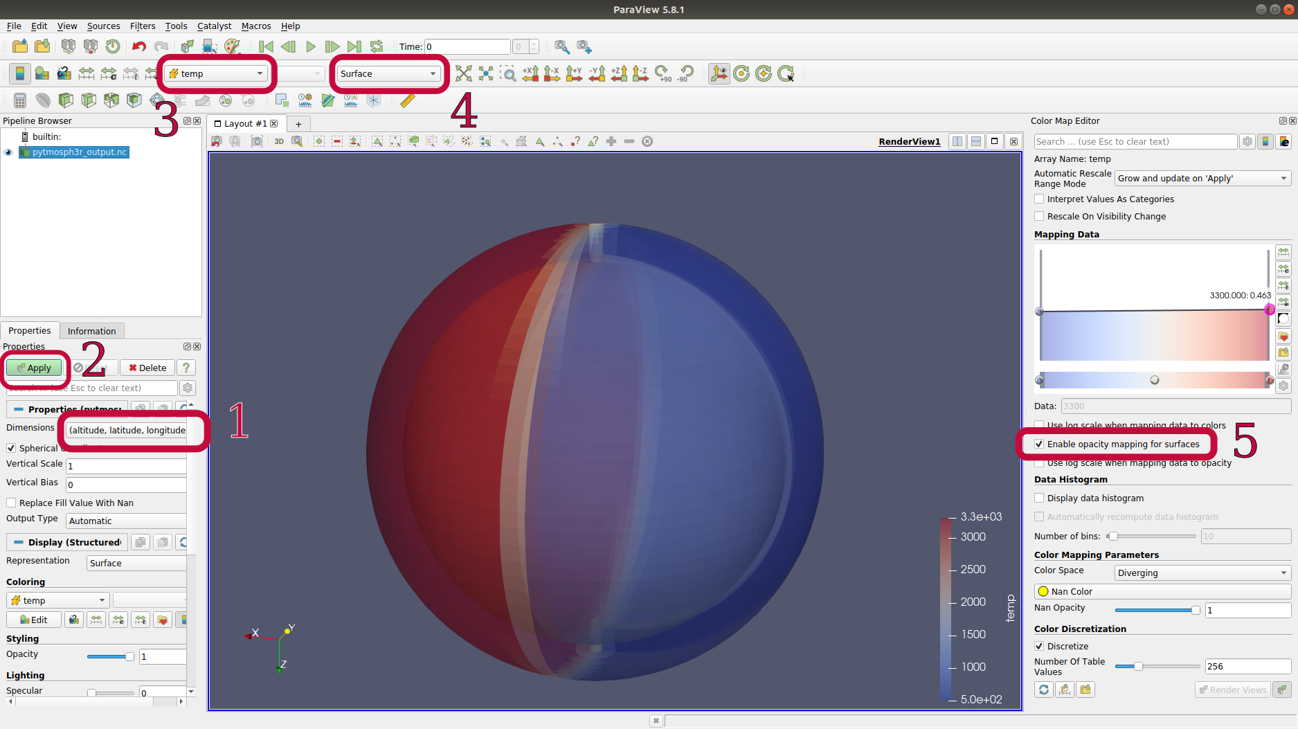
The interface should look like the following image. In red are highlighted steps to visualize the temperature. You can of course play with steps 3, 4 & 5 for other representations!
A nice feature of paraview is that you can truncate the data at a specific value. For example, we could truncate the pressure between two thresholds and see what the temperature looks like at these pressure levels:
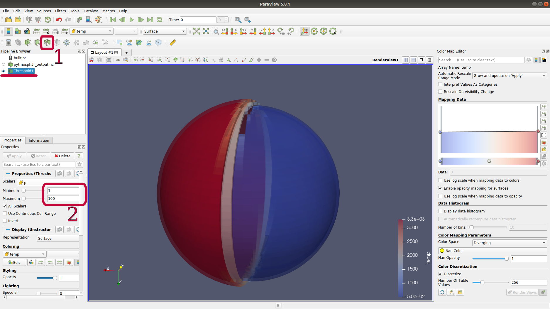
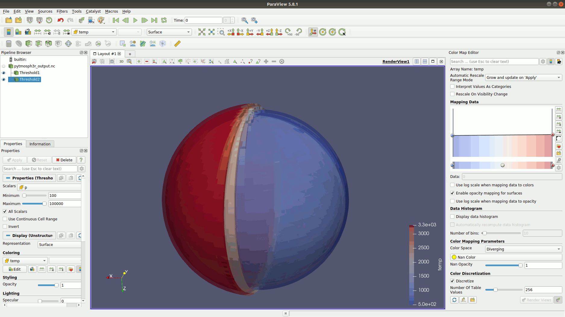
You can add multiple thresholds with different opacities (step n°5 two figures above), to obtain something like this:
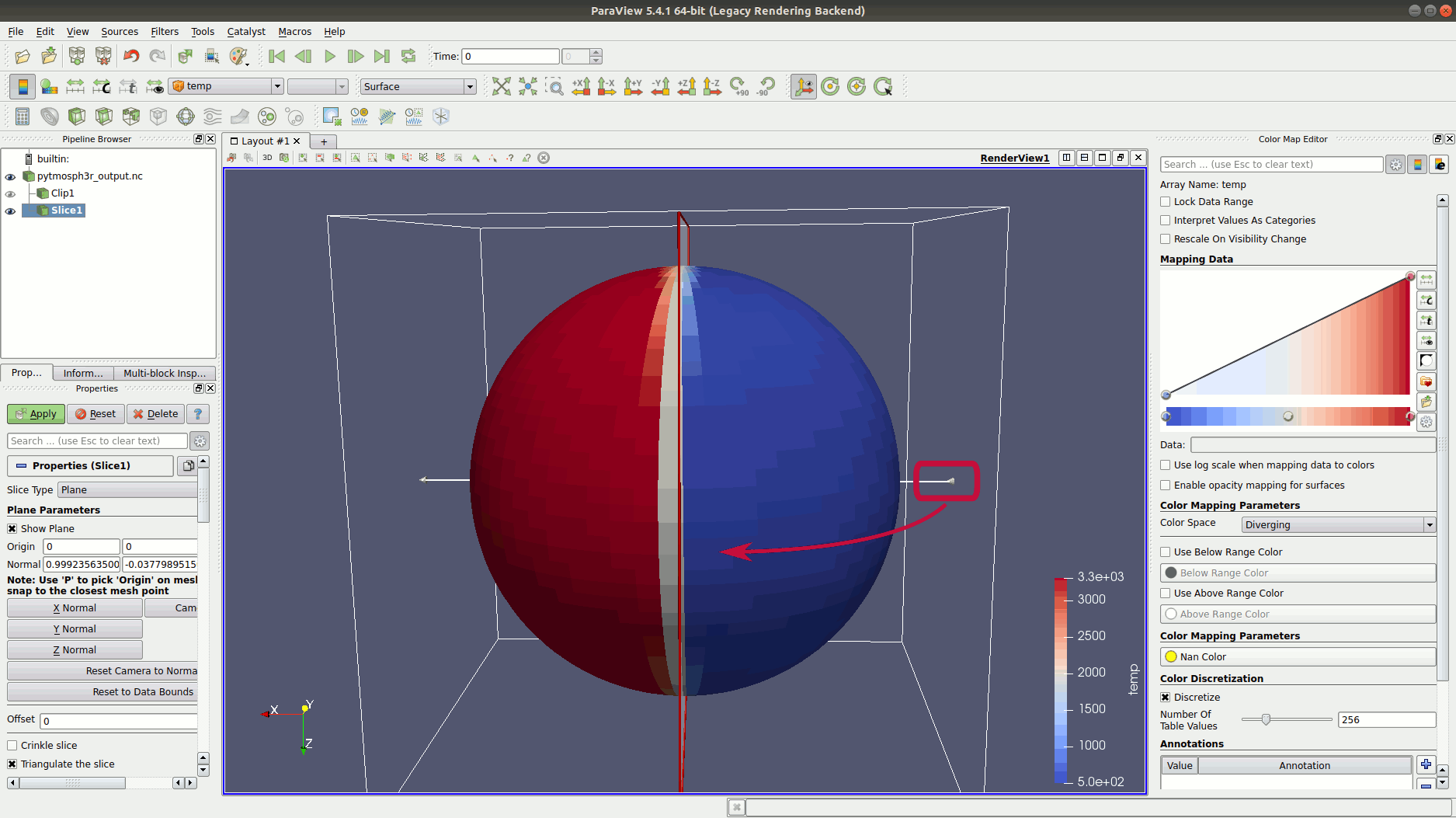
Another way to visualize the atmosphere is to make a slice:
Note
You should probably change the scale of the radius to enlarge the (relative) size of the atmosphere. You can do that with the option ‘-r’ of pytmosph3r or pytmosph3r-nc-to-nc.
You can also plot the pressure, the gas or aerosol mixing ratios, etc. Feel free to explore the possibilities!